
Serenity
Noun, The state of calm, peaceful and untroubled.
Time
How we wish we had more time.
The seaside is a place of childhood memory for the artist, for whom it has always been an escape from the realities of day to day life. A safe haven for her, the sea brings serenity. We all have memories we choose to forget or are fragmented. The sea is an agent that rearranges the beach as the tide comes in and out, removing imperfections just as our brain removes the bad from memories.
In Mediated Memories, Jose Van Dijk discusses the idea that memories are rewritten each time they are active. We will alter them every time we remember them. For this reason, some memories loom larger than others, reflected here in the different sizes of print.
Memories are not always remembered as a picture, but come with the sounds and feelings of past experiences. Reflecting this multisensoriality, the artist often includes braille in her work, and here the physical experience of the beach is presented in the use of natural materials. This project allows the audience to delve into an experience when viewing the work as it can viewed from many angles that may change your perspective on a certain image. The artist has chosen this layout to allow different interpretations as we all remember times differently.
The images are titled Braille 1, Braille 2, Braille 3 etc, this is so the viewer is not given any information about the image however the braille in the bottom right of the image acts as a description for the visually impaired, allowing them to experience something that the visually able cannot.
Project Process
As an avid Darkroom user I wanted to experiment with a new technique, Liquid Light. The liquid light process allows us as artists to coat any surface with chemical and print onto it. For example rock, fabric and slate. These are the three main objects I decided to coat. There is a lot of experimentation involved with this technique and it can be frustrating if it does not work but you have to consider the density of your object and how porous it is for soaking in the chemical. Liquid emulsion needs to be exposed to light once the object is coated and fully dried. This is done by using an enlarger with film in. You are then able to put any image onto the object.
When Using liquid light it was important that is coated enough of the materials to use two as testers. When testing I used intervals for 5 seconds for light exposure on to the now light sensitive material. I choose to use rocks form the seaside as I wanted to create an interactive part to my project so that the viewer would be able to touch the work.
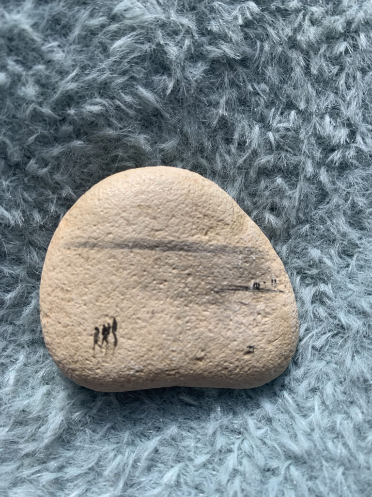
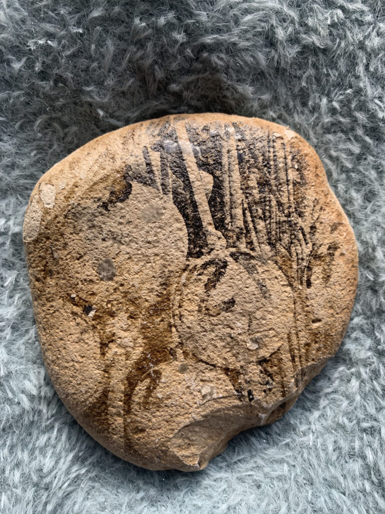
After experimenting with liquid light or rocks and slate , which didn’t work I choose to experiment with fabric. I choose to. use cotton as it would be a thin enough material to not need lots of coats of liquid light unlike the rocks. When experimenting with fabric I found I got a clearer image on the fabric which is what I wanted. The density of the image were a lot clearer which followed on from previous research with Blind Veterans UK, when speaking to them they had said denser images were clearer for them to see.
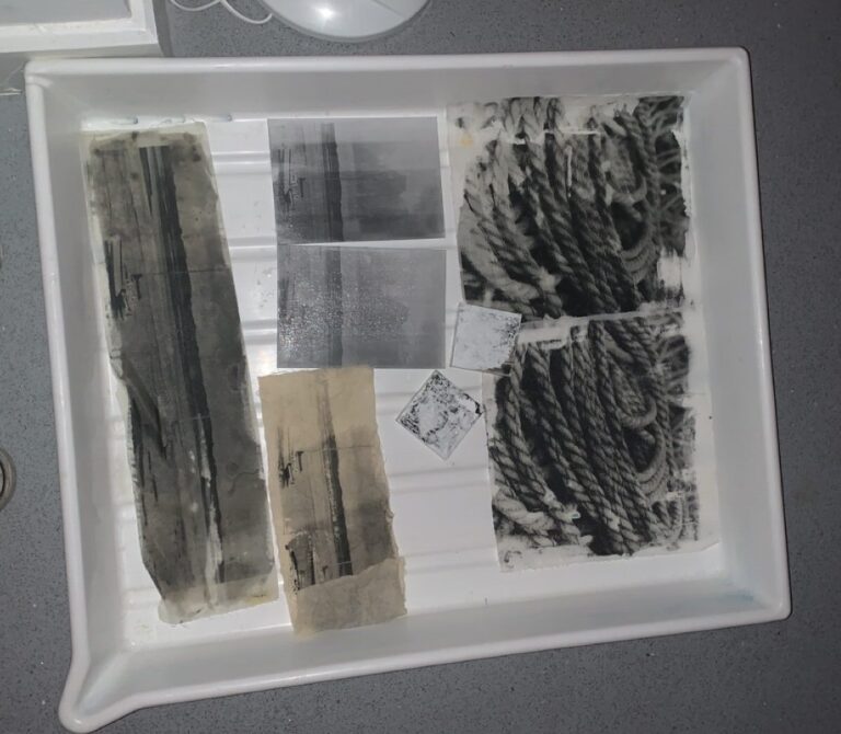

After using liquid light on fabric I then started to think about other ways in which I could print my work. I moved on to working with digital images as I researched ‘Mediated Memories’ by Jose van Dijck. This looked at how we reimagine memories.
I began by using black and white analogue images as I believed this would show that I was representing my old memories however I have moved onto using digital colour images as the book made me rethink my project idea. I more want to represent that the memories I think of are always going to be there but every time I go back I re imagine them and change this because of the new memories I am making. Using digital images has allowed me to go larger with my images so that they are clearer and stand out it also allowed me to have a more tactile piece of work. I have also been able to use sheer fabrics would have been difficult to use with liquid light.
Using sheer fabric has allowed me to truly show that some memories are more faded than others it also allows me to overlap images when hanging for exhibition so that it interprets that memories are interlinked and remembering one memory can lead to another and so on.
The exhibition plan and my part in exhibition
Most of us have seen an exhibition at the final stages but there is a lot that goes on behind the scenes. As part of the Exhibition planning team I took on the roll of design team leader, this meant I needed to delegate tasks to my team while also working on designs myself. I decided to focus on the brochure as my main job while my team worked on invites and posters, these were mainly for marketing purposes. When deciding on designs it was important not to be biased by who’s designs they were and to mainly think about what would look best to the public and entice them to see our exhibition.
When designing the brochure I needed to make sure that the design was kept simple so that the actual design of the brochure took away from the artists work. I also needed to make sure the organising team was aware of what I needed for these brochures so they could set deadlines for all participants. This included a deadline for artwork for brochures, posters and invitations. I then had to make sure I had all margins organised on my photoshop documents. Once I had my layout I could then input all text and images to the layout to create a professional simple brochure. Proof reading was an important part to consider as part of time planning and scheduling as I needed to make sure all spellings were correct and that the statements read well to be seen by the public. This meant also balancing my work around tutors work to allow them time to read through.
This experience has taught me how to manage my time when creating advertisement material while also managing to create my own exhibition. It has also been interesting working with my peers to create a exhibition show that will end our three years at the university together.